
Zihan Wang
Overview
Finding a place to call home is a journey, and HomeFinds was designed to make that journey smoother and smarter. The platform provides a user-friendly experience for exploring properties, connecting with agents, and making informed decisions. With a focus on accessibility and efficiency.

Figma
Photoshop
Navigating the real estate market can be overwhelming due to scattered information, lack of transparency and cumbersome platforms. Users need a centralized. easy-to-navigate solution to simplify the buying, renting, and selling processes.
To design a responsive, asthetically pleasing and intuitive platform that empoders users to manage property trnasantions effortlessly while delivering a seamless cross-device experience.
Problem Statement
Goals

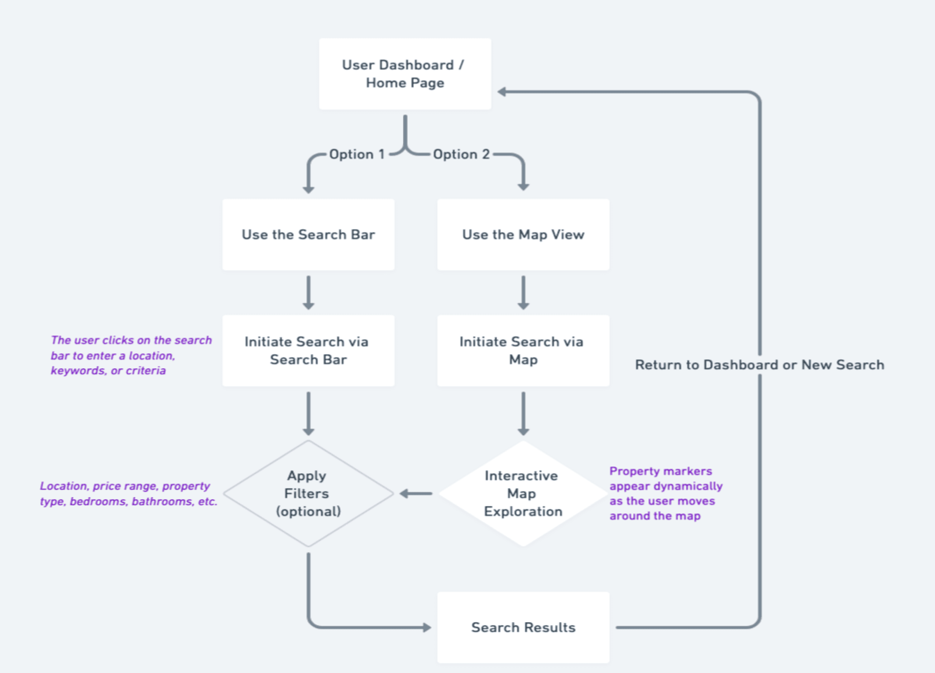
User Flow

"As a user, I want to create a profile containing all my property criteria, so that I am recommended results most relevant to me."
"As a user, I want to be able to search and filter properties, so that I can find good matches based on my needs."

Wireframes
Wireframes are where the magic begins! They laid the foundation for HomeFinds, guiding the design process from rough ideas to refined solutions.
Low fidelity wireframes
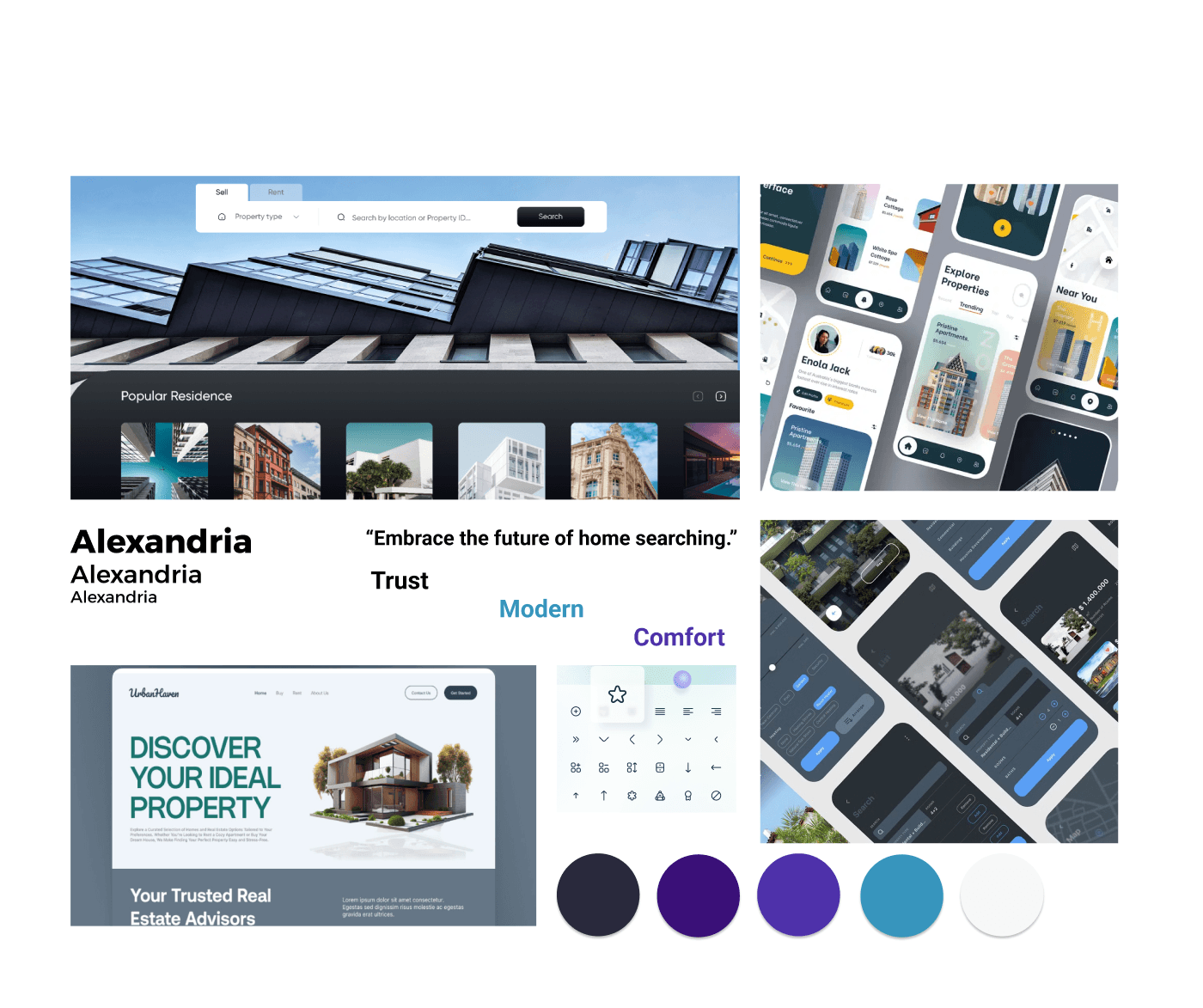
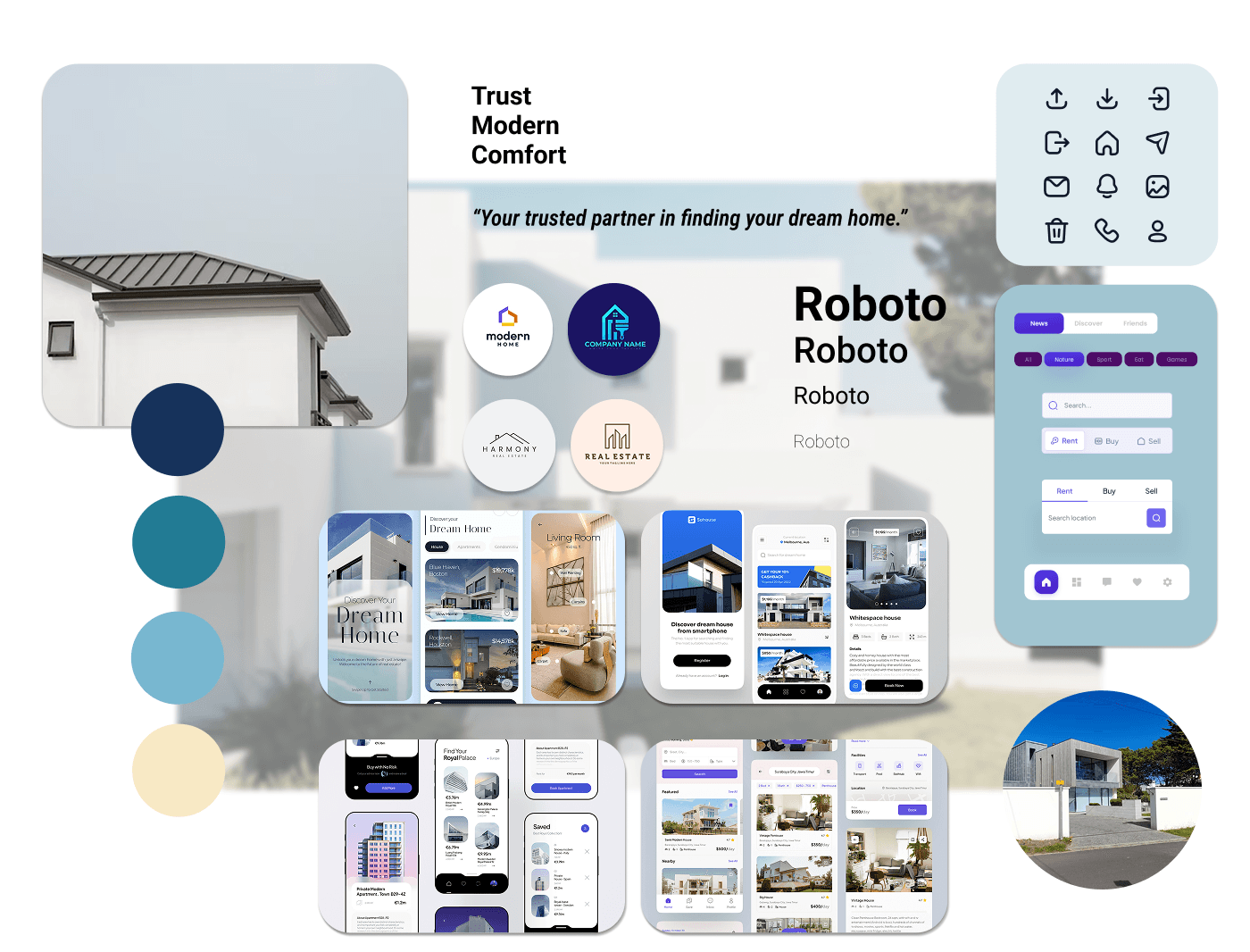
The mood board was the creative spark behind HomeFinds. From soft, approachable tones to clean, modern fonts, every element was chosen to make users feel confident and excited about their property journey.
Mood Board
Style Guide
Typography
I paired Roboto and DM Serif Display to create a harmonious balance of functionality and sophistication.
Roboto: Clean, modern, and highly readable, perfect for guiding users through the app with ease.
DM Serif Display: Adds a touch of elegance and personality, making headlines and key moments feel bold and memorable.
This pair ensures an approachable yet polished look, enhancing the user experience while maintaining a professional tone.

Logo and Iconography

16x16 pixels: For small icons in dense interfaces or toolbars.
24x24 pixels: For medium-sized icons, typically used in buttons or navigation.
32x32 pixels: For larger icons, often used in primary actions or key interface elements.
48x48 pixels: For even larger icons, used in settings menus or prominent features.
Standard Sizes
Color Palette
Main
Primary
#2850C6
400
#3E61CA
300
#5A78D1
200
#7F97E0
100
#A3B8E8
50
#E6ECFA
Secondary
#F0635A
400
#F3746E
300
#F68C86
200
#F9ADA9
100
#FBCDCB
50
#FDEAE9
Alert & Status
Success
#1FC25B
Info
#2656B8
Warning
#EECE4D
Error
#FE2626
Disabled
#D8D8D8
Greyscale
900
#212121
800
#424242
700
#616161
600
#757575
500
#9E9E9E
400
#BDBDBD
300
#E0E0E0
200
#EEEEEE
100
#F5F5F5
50
#FAFAFA
I chose color palette for the estate app to create a vibrant, inviting, and user-friendly experience. The combination of deep blue as the primary color conveys professionalism and trust.
The secondary color adds warmth and approachability, making the app feel welcoming. This balance is essential for fostering a positive emotional connection with users, encouraging them to explore listings and engage with the platform.
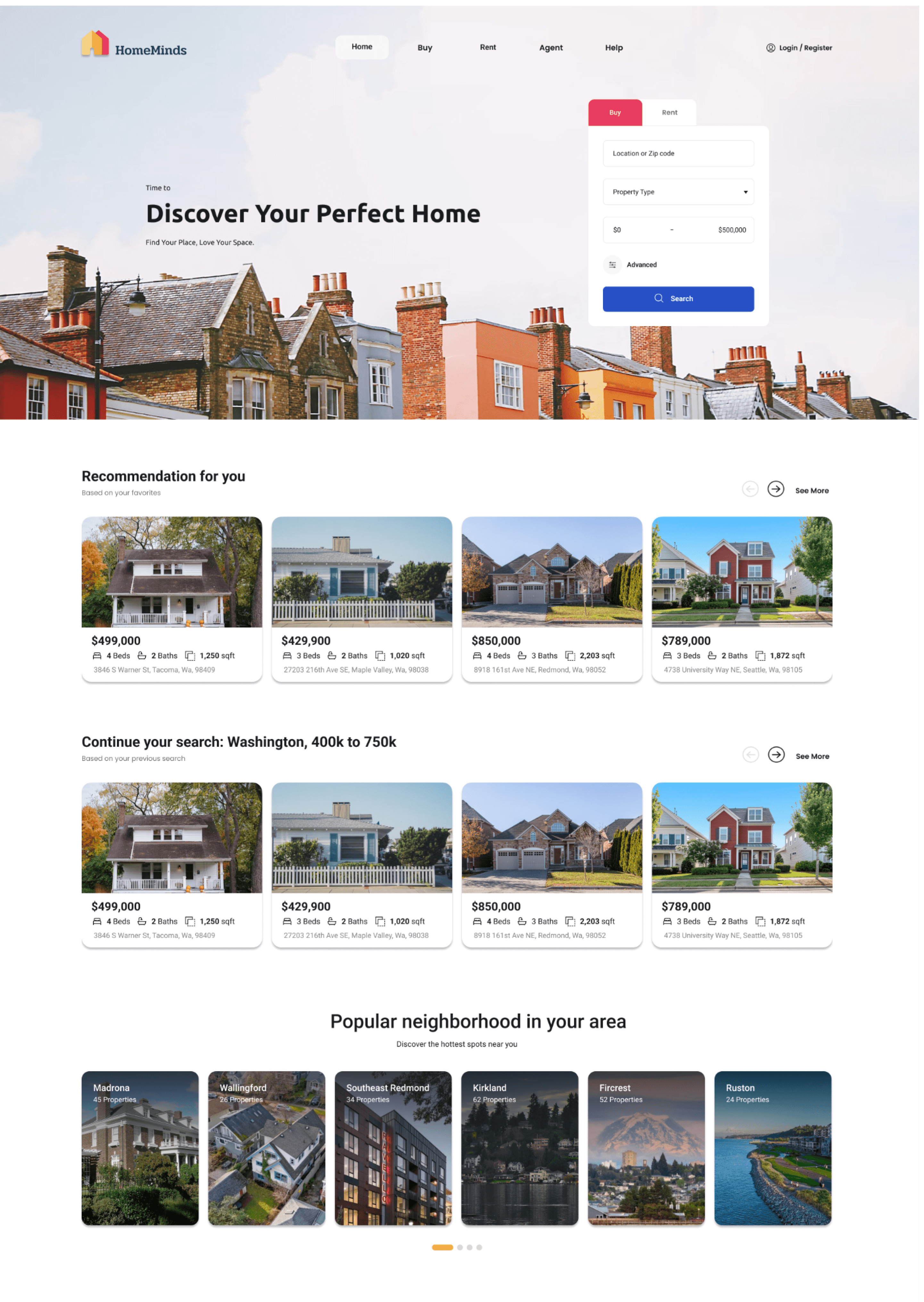
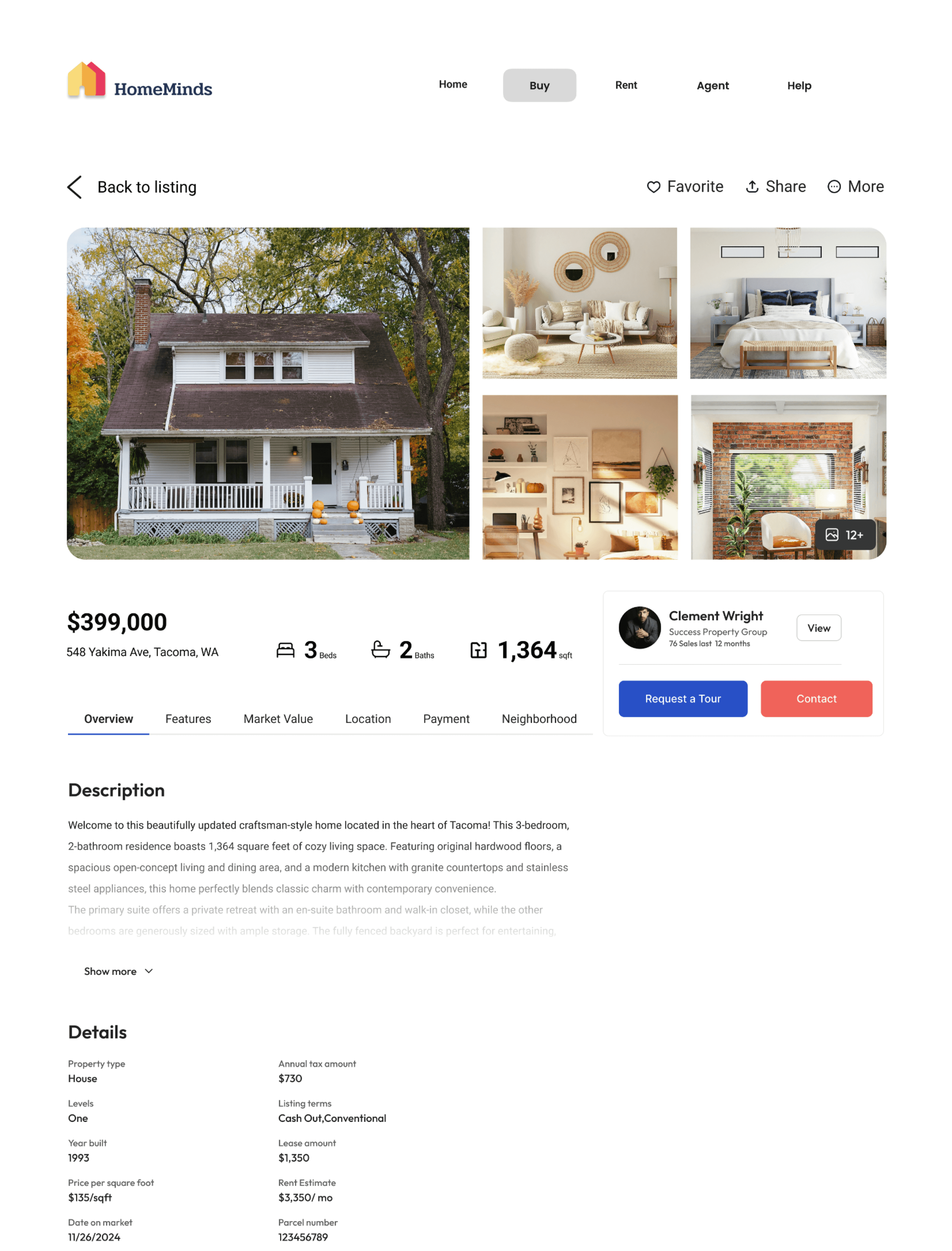
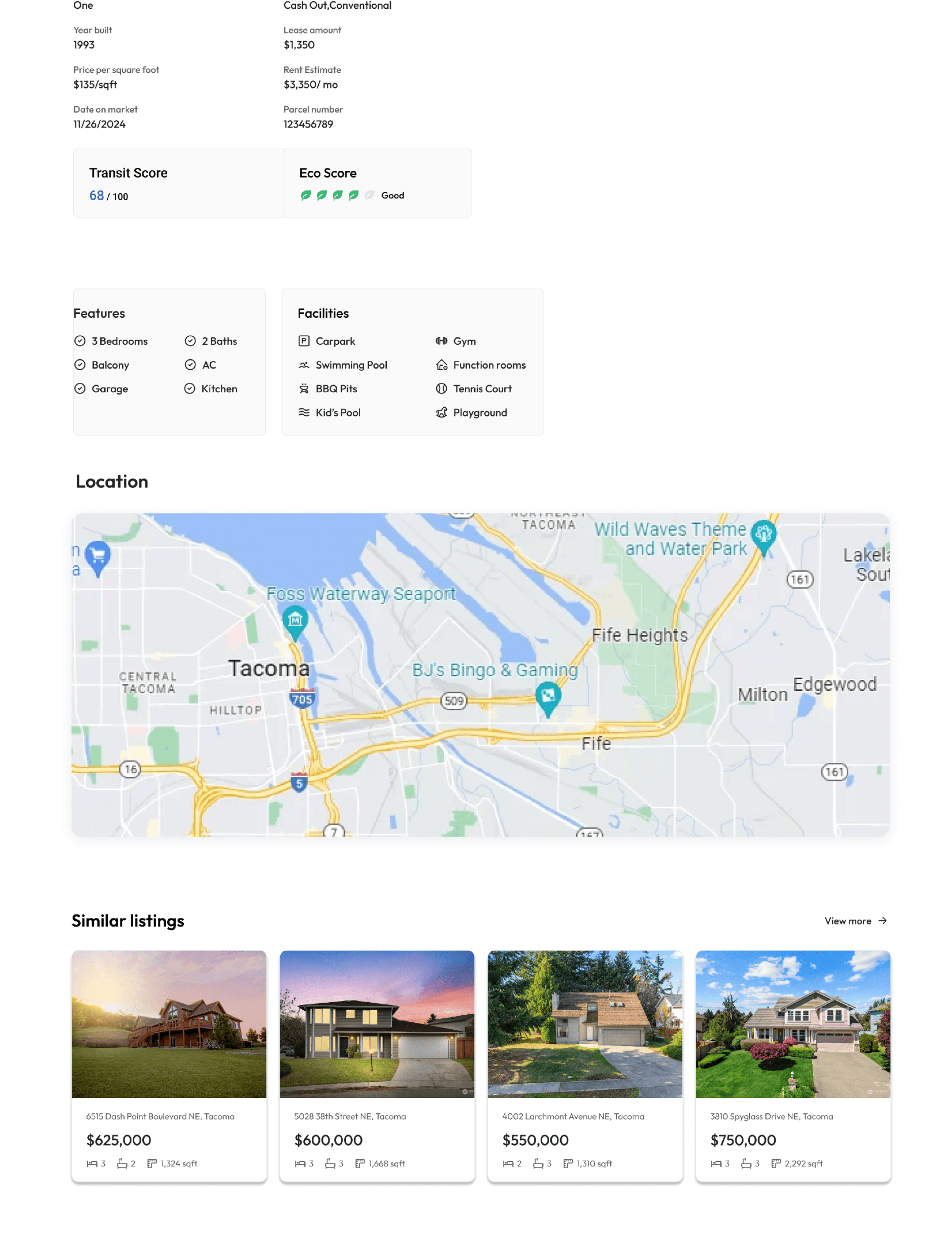
HomeMinds
HomeMinds

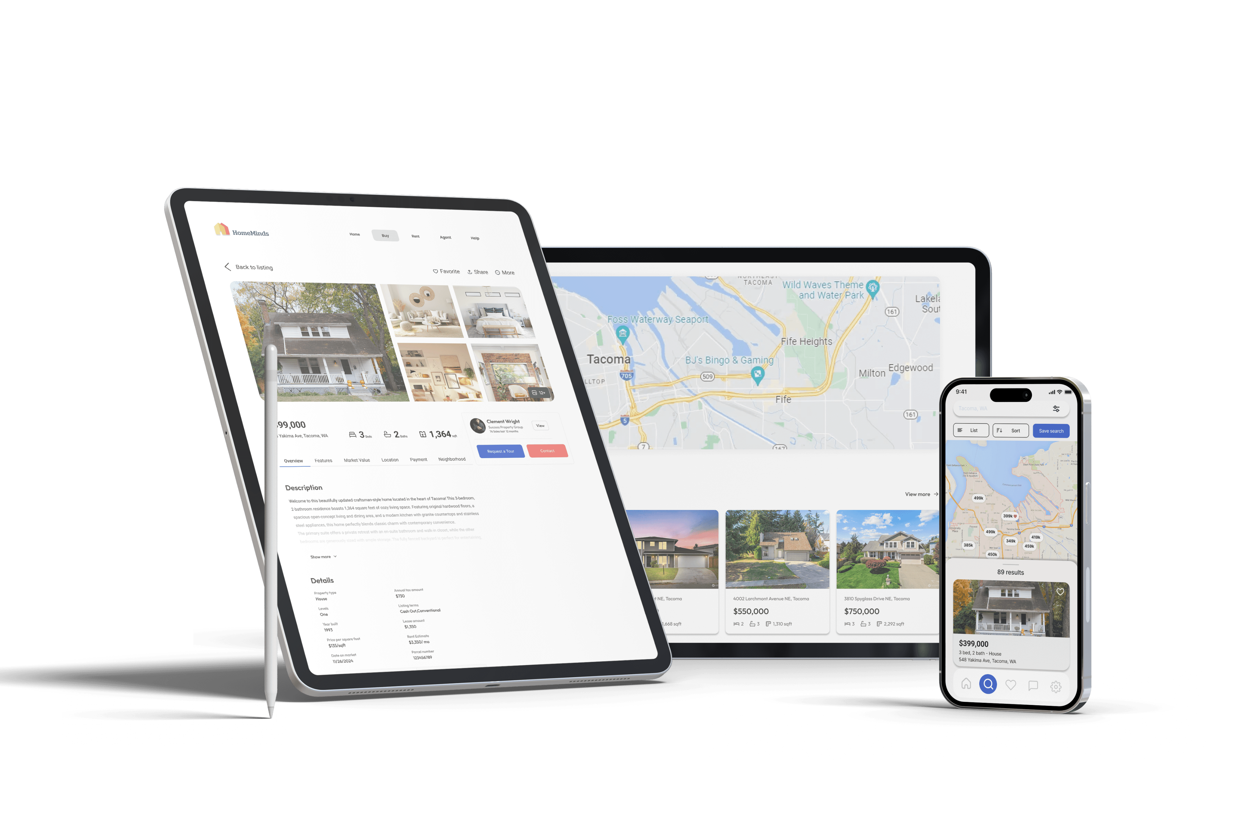
Designing for Breakpoints
HomeFinds was designed with adaptability in mind, ensuring a consistent and intuitive experience across devices.
Desktop Layout: A 12-column grid with 120px margins and 20px gutters offers a balanced and spacious design for larger screens.
Tablet Layout: An 8-column grid with 80px margins and 20px gutters provides a clean, optimized interface for mid-sized screens.

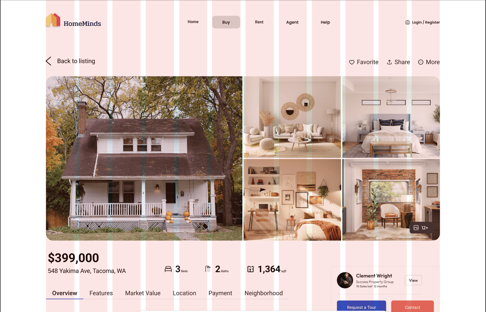

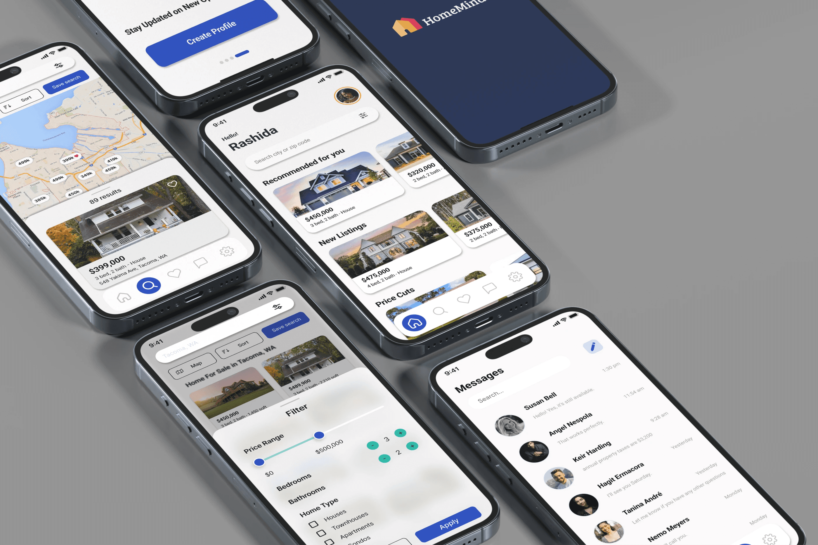
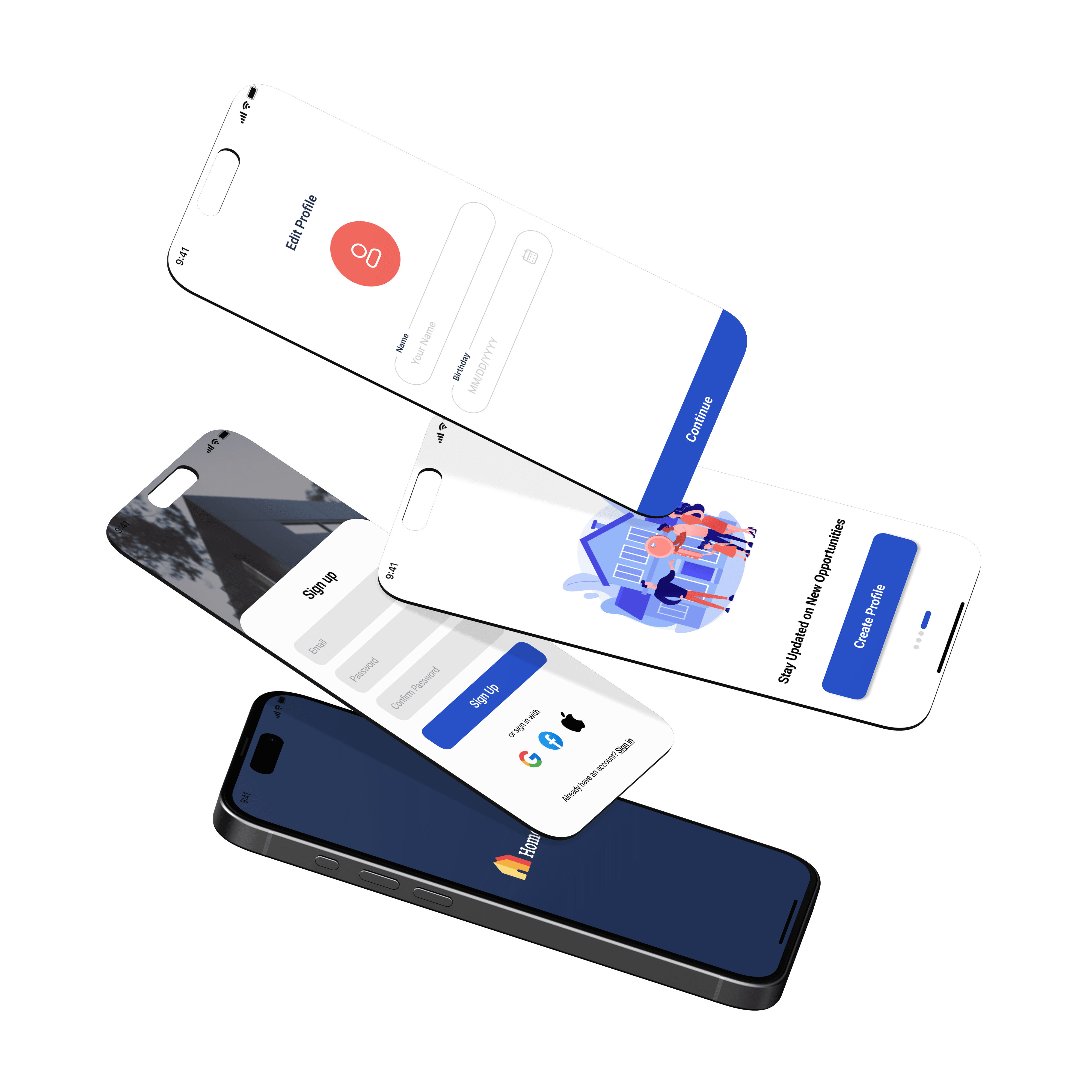
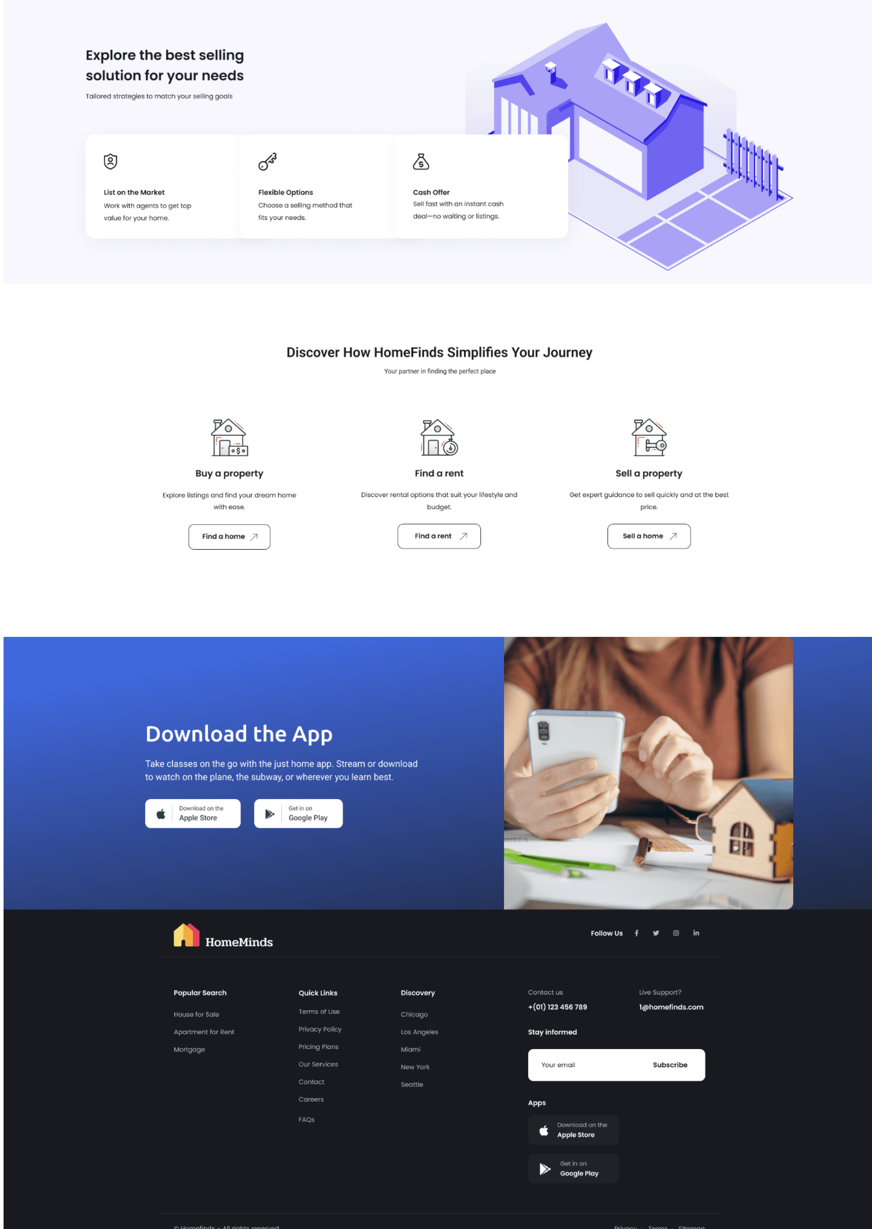
High fidelity wireframes

Takeaways

Designing HomeFinds was an incredible learning experience. It emphasized the importance of user-centered design, adaptability across devices, and creating a seamless journey for all types of property seekers. I refined my skills in responsive design, prototyping, and creating consistent, visually appealing interfaces. Most importantly, I learned the value of simplicity in design—making complex processes feel effortless for the user.
This project has laid a strong foundation for my growth, and I’m excited to continue honing my craft to create impactful, user-friendly designs!

Real estate
Web Responsive App
UX/UI Case study
HomeMinds