

CareerFoundry Project
2024
MY ROLE
TOOLS
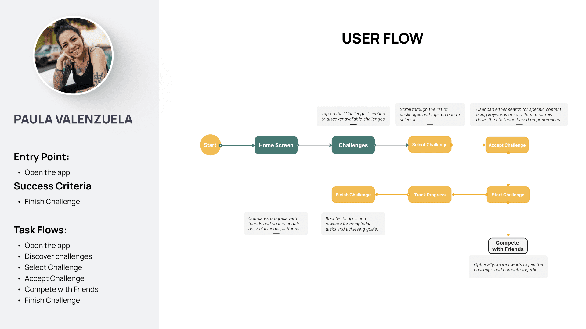
Exploring the problem
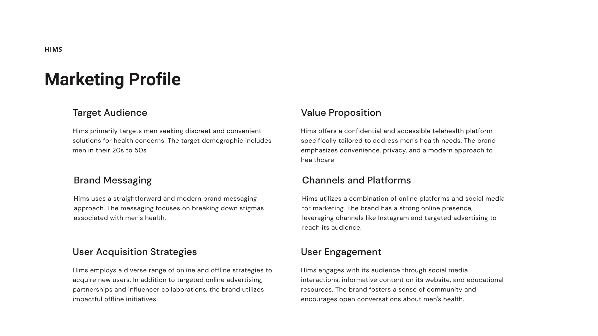
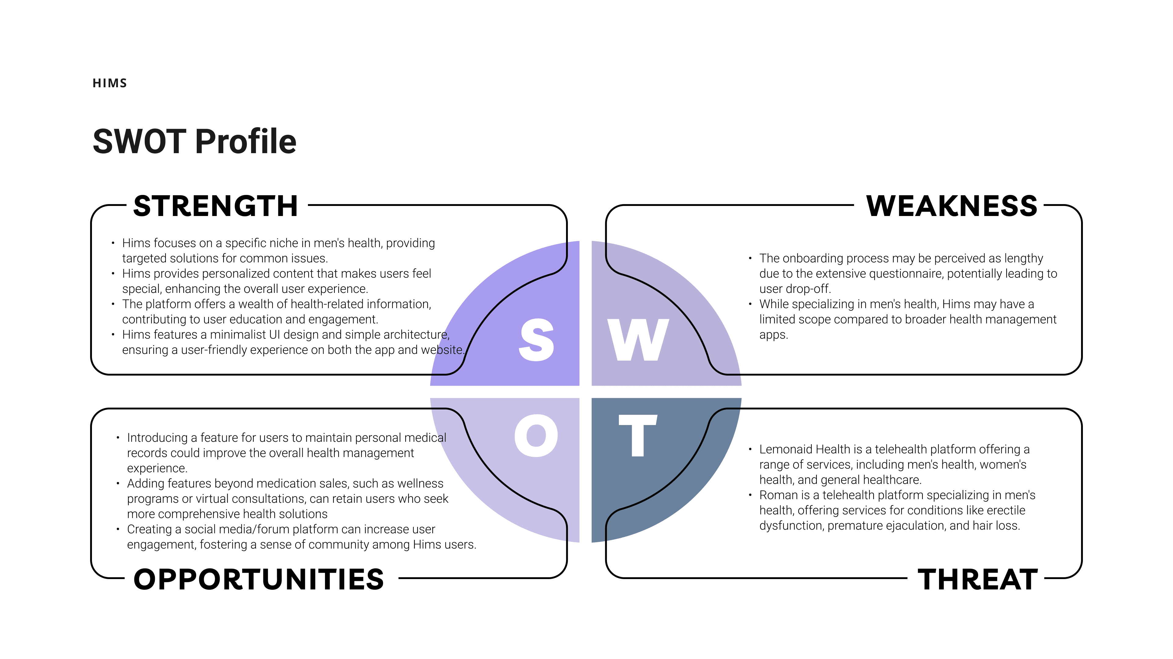
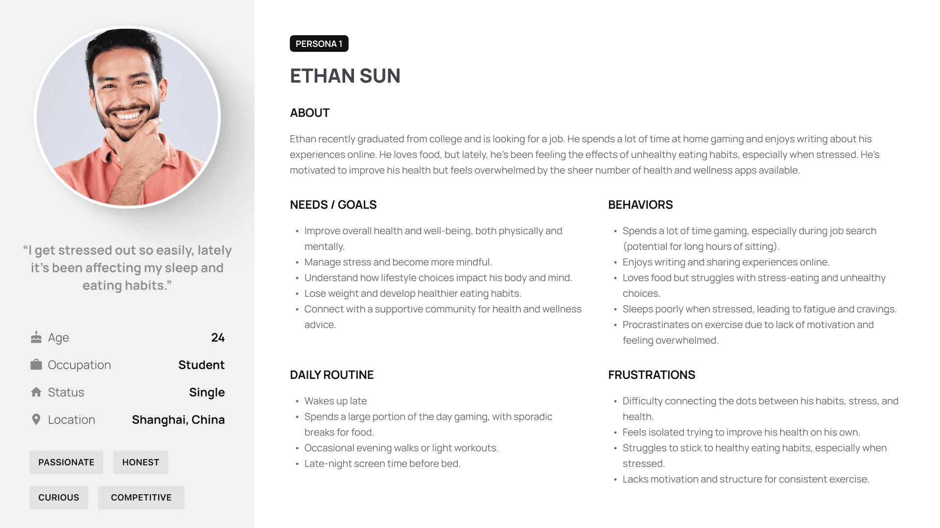
To position Olive effectively, I analyzed two wellness apps — Hims and Breeze, focusing on their strengths, weaknesses, and user experience gaps, I identified key takeaways to shape Olive’s unique value proposition:
Personalization is lacking – Olive should prioritize customizing experiences to better support individual mental health needs.
2
Privacy & accessibility matter – Hims succeeds in offering discreet healthcare. Olive should adopt this principle by ensuring a safe, judgment-free space for users.
3
Engagement drives retention – Breeze offers interactive assessments, reinforcing the need for actionable insights and engaging UX in Olive.


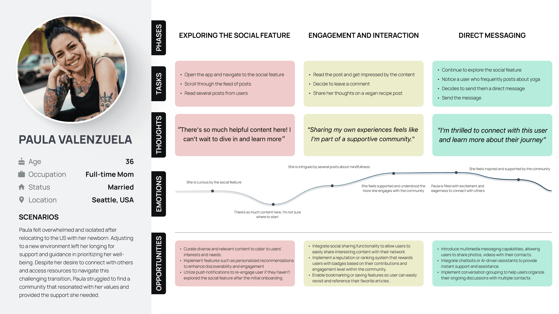

The card sorting exercise revealed how users categorize app features, helping identify natural groupings through the standardization grid and similarity matrix.


Low-Fidelity prototype
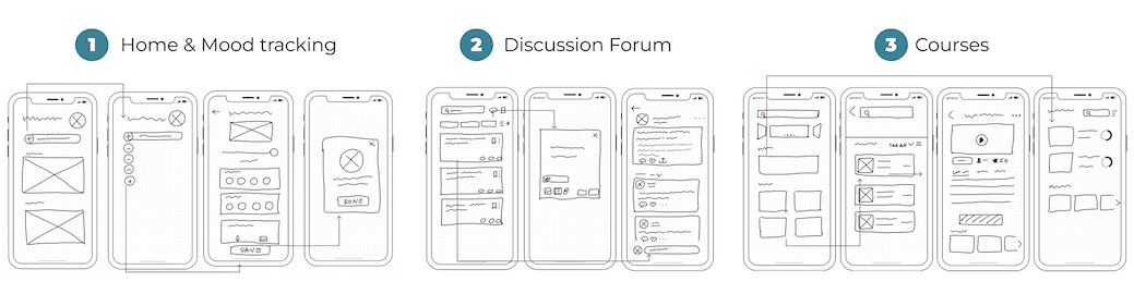
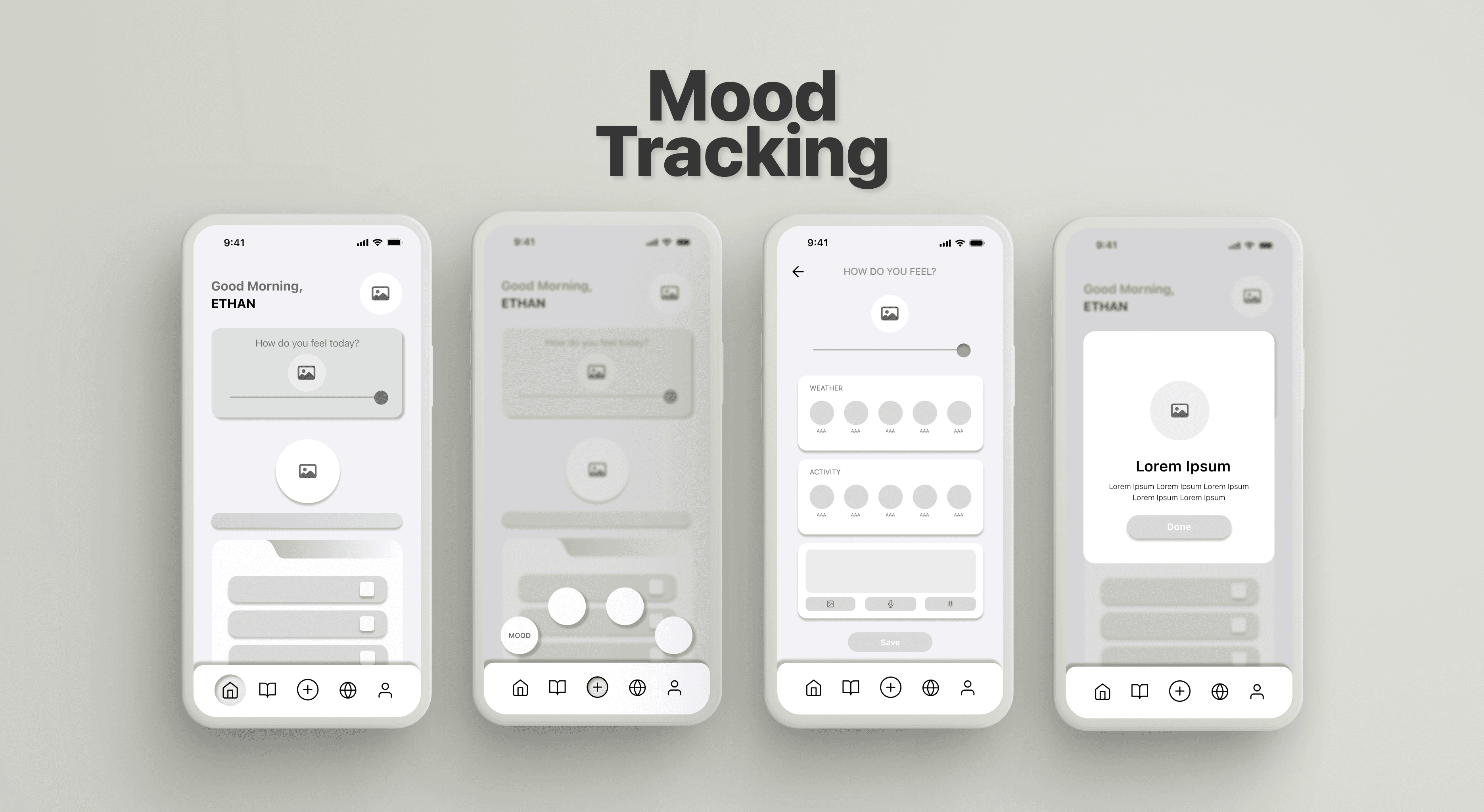
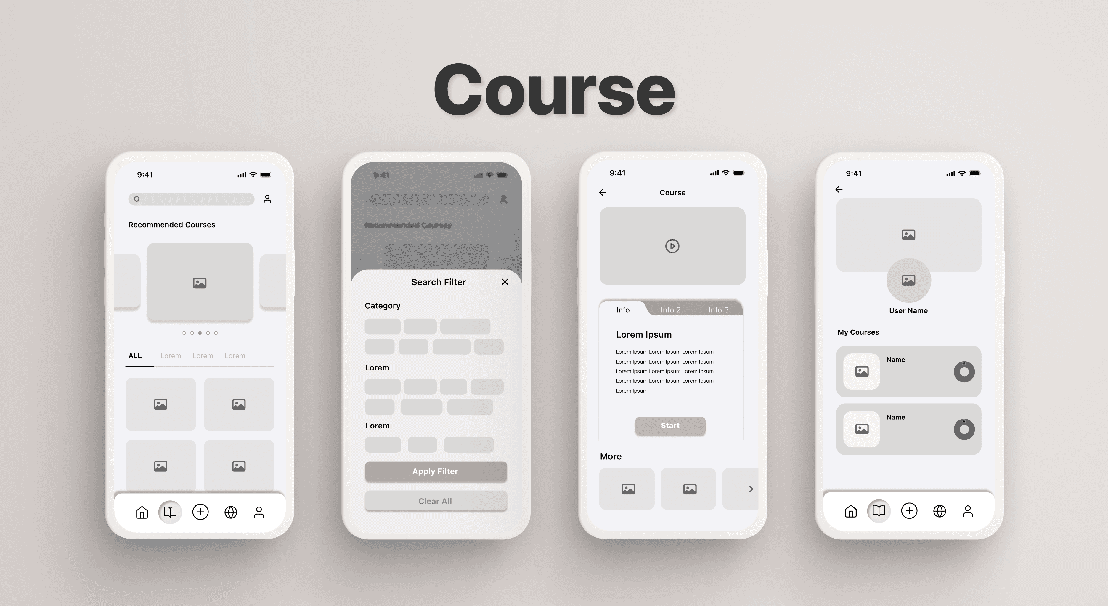
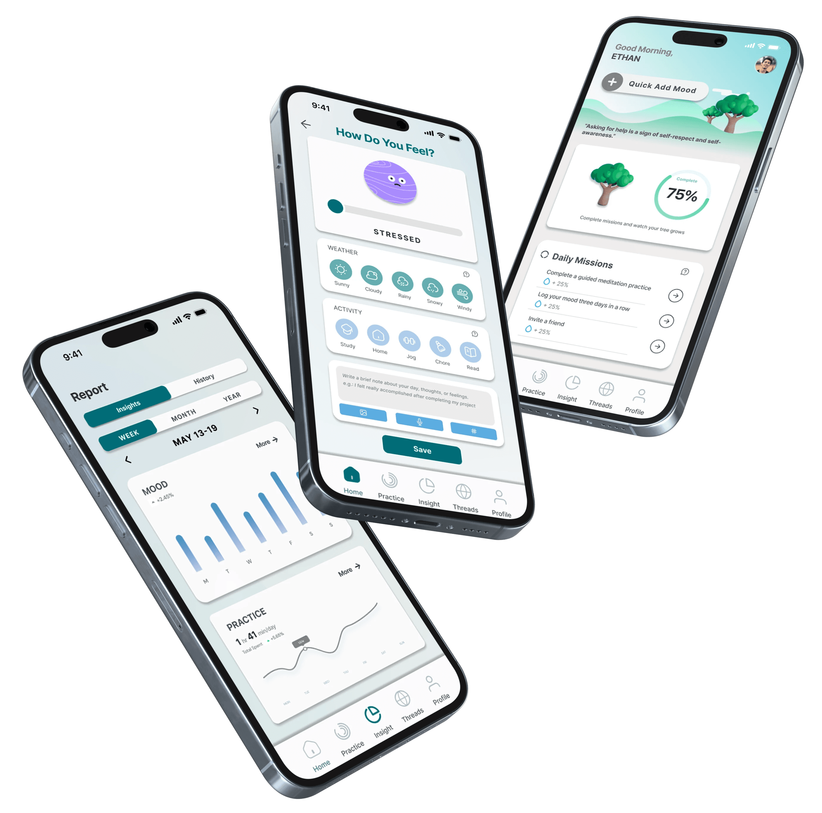
Mid-fidelity Prototype


Usability Test


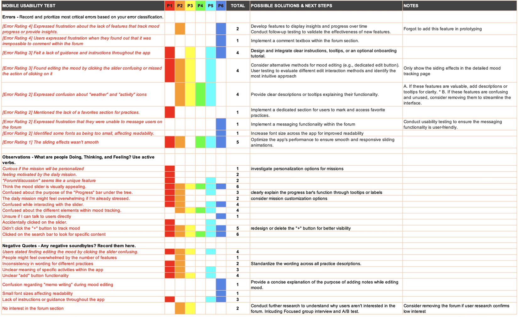
What we learned
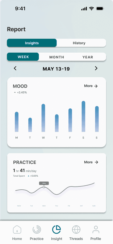
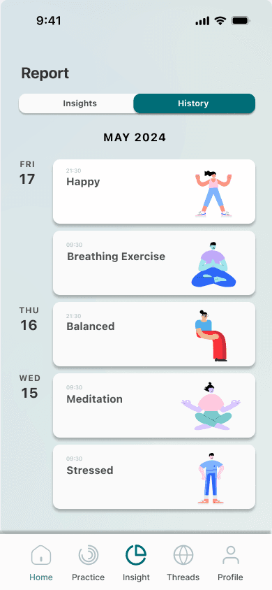
REPORTS


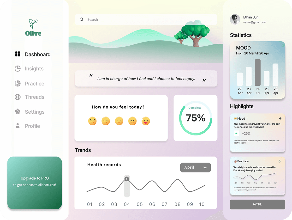
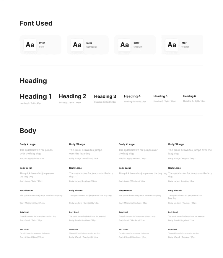
STYLE GUIDE
The Olive Style Guide reflects a calming and supportive design, prioritizing accessibility and user comfort. The color palette was chosen to evoke a sense of tranquility, while the typography ensures readability and warmth.

WHAT I LEARNED
1
It's All About the User
You can't make assumptions about what people want - you have to listen.
Through testing and feedback, I learned how crucial it is to give users more control over their wellness journey.
2
Prototyping: Where the Magic Happens
I went through multiple iterations of Olive, and each version was better than the last.
Prototyping, testing, refining, and doing it all over again taught me that the perfect design doesn't happen overnight. It's a marathon, not a sprint, and I enjoyed every lap.
3
Feedback is a Gift (Even When It's Tough)
Whether it was from my mentor, peers, or testers, feedback was everything. Hearing other perspectives on what could be improved really shaped the way Olive grew. I learned that collaboration is key, and sometimes the toughest feedback leads to the best solutions.
4
Accessibility: It's Not Just a Box to Tick
I went into this project knowing I wanted Olive to be inclusive, but I didn't fully realize the depth of what that meant until testing. From color contrast to keyboard navigation, I learned how important it is to design with everyone in mind. Small changes made a big difference in creating an app that works for all users, regardless of their abilities.